WHIP IN
WHIP IN
WHIP IN
It all started with a message from Melato—a DJ from Lyon I didn’t know at the time.
“Hey, I’m launching a private techno club in an apartment. Want to design everything?”That was the beginning of WHIP IN. He is now a good friend, and this project became my first full freelance experience: visual identity, 3D teaser, motion design, Twitch live, everything. It was raw, intimate, and full of freedom — a chance to shape the world of a micro-club that only exists behind closed doors.

CONCEPT
CONCEPT
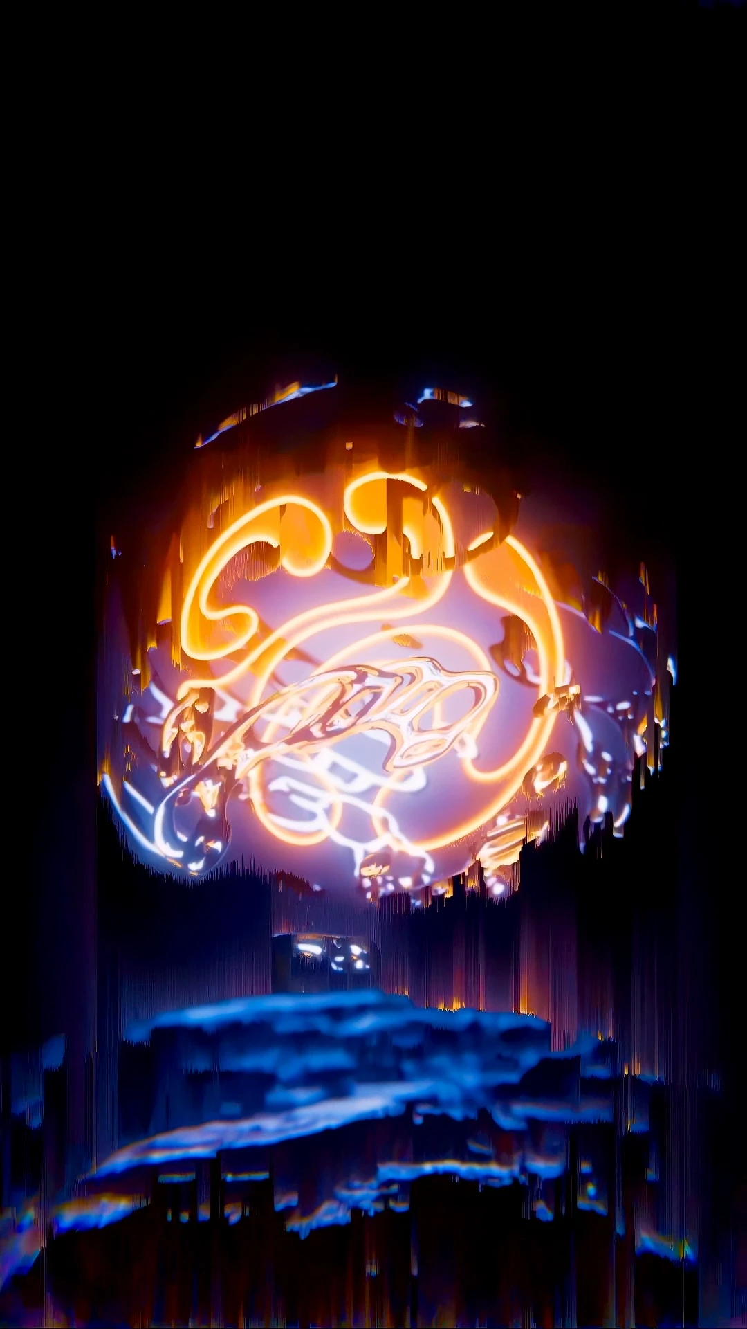
The main idea was mix. WHIP IN brings together people, sound, and energy in a small, hidden space. I wanted the visual identity to reflect that: abstract, hypnotic, and fluid, like a beat bouncing around a room with no edges.
The logo became the anchor: three curved forms forming a circle, representing the club’s three core musical energies. The 3D teaser picked up from there. Chrome forms are floating, pulsing, blending. Everything had to feel like it was part of the same atmosphere.
CONCEPT
The main idea was mix. WHIP IN brings together people, sound, and energy in a small, hidden space. I wanted the visual identity to reflect that: abstract, hypnotic, and fluid, like a beat bouncing around a room with no edges.
The logo became the anchor: three curved forms forming a circle, representing the club’s three core musical energies. The 3D teaser picked up from there. Chrome forms are floating, pulsing, blending. Everything had to feel like it was part of the same atmosphere.
RESERARCH
RESERARCH
The keyword that shaped the whole direction was cycle. I started there—sketching circular logos, mapping abstract shapes that could orbit or merge.
I pulled from visuals like lava lamps, metallic fluids, and the hypnotic motion you find in generative techno visuals. I also took inspiration from labels like BCCO, who mix minimalist branding with deep, immersive motion.
The goal was to create something intimate but sharp. Something that feels right at 2AM, in a dark apartment, with speakers shaking the floor.
RESERARCH
The keyword that shaped the whole direction was cycle. I started there—sketching circular logos, mapping abstract shapes that could orbit or merge.
I pulled from visuals like lava lamps, metallic fluids, and the hypnotic motion you find in generative techno visuals. I also took inspiration from labels like BCCO, who mix minimalist branding with deep, immersive motion.
The goal was to create something intimate but sharp. Something that feels right at 2AM, in a dark apartment, with speakers shaking the floor.
DESIGN
DESIGN
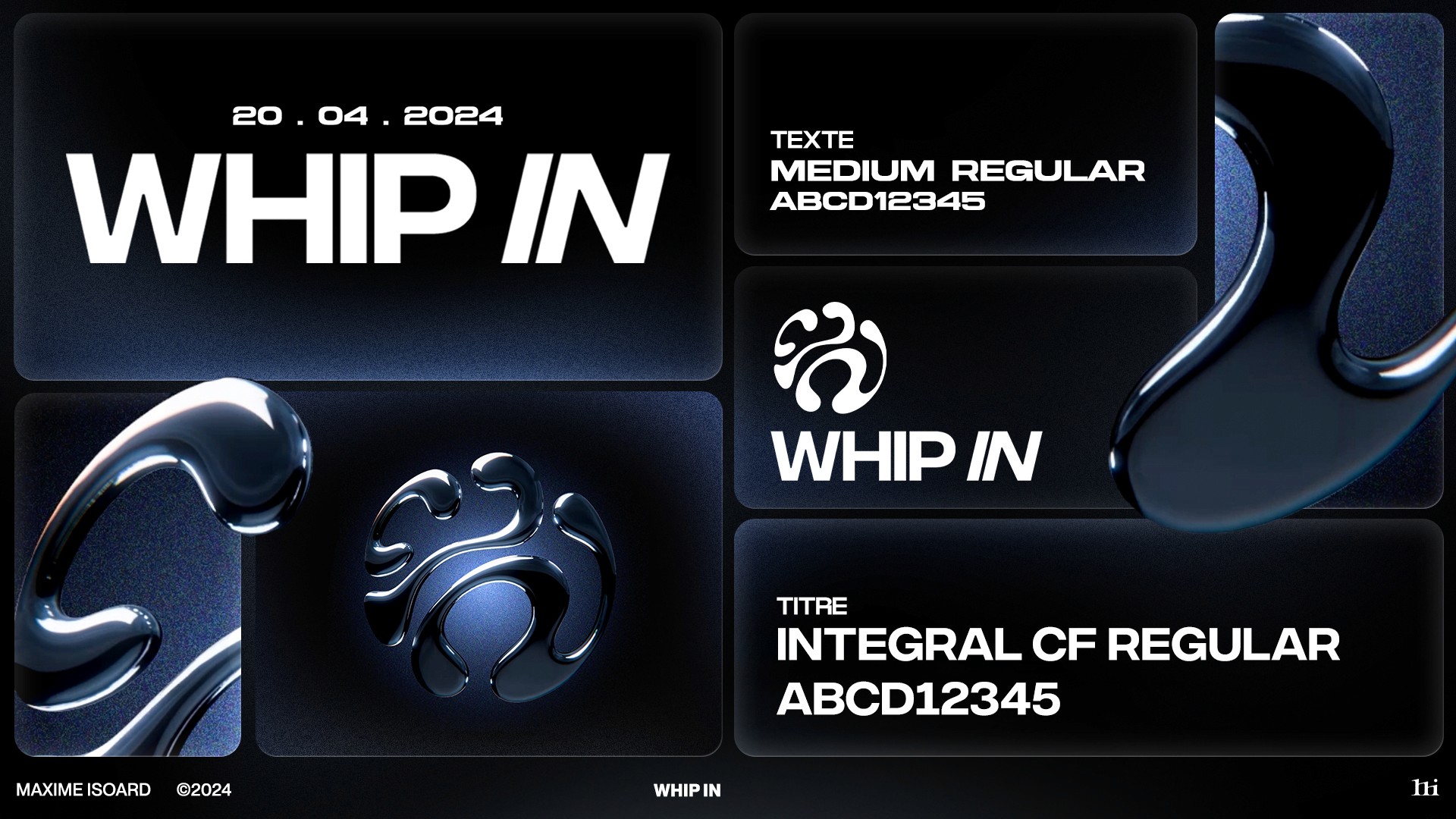
The identity plays on dualities: bold logotype vs. delicate motion & glass textures. The visuals stay immersive, built from just a few materials and colors.
The teaser has three looping scenes, each focused on the logo evolving in space. The forms rotate, stretch, and glow. Always moving, never static. The typography is thick and no-nonsense, grounding the abstract energy in something solid. Everything is built to live well in vertical formats, made for stories and reels.
DESIGN
The identity plays on dualities: bold logotype vs. delicate motion & glass textures. The visuals stay immersive, built from just a few materials and colors.
The teaser has three looping scenes, each focused on the logo evolving in space. The forms rotate, stretch, and glow. Always moving, never static. The typography is thick and no-nonsense, grounding the abstract energy in something solid. Everything is built to live well in vertical formats, made for stories and reels.
DEVELOPMENT
DEVELOPMENT
I built the entire animation in Blender using Geometry Nodes for clean, infinite loops. The lighting and reflections were key. I wanted the forms to feel physical and liquid at the same time.Each scene was composed to highlight the logo differently, while keeping a shared tempo.
This project taught me a lot about translating sound into motion, and how a strong identity can exist across mediums even when the club itself is hidden.
DEVELOPMENT
I built the entire animation in Blender using Geometry Nodes for clean, infinite loops. The lighting and reflections were key. I wanted the forms to feel physical and liquid at the same time.Each scene was composed to highlight the logo differently, while keeping a shared tempo.
This project taught me a lot about translating sound into motion, and how a strong identity can exist across mediums even when the club itself is hidden.