DATA 01
DATA 01
DATA 01
This project comes from my love of type—and from a fascination with how old-school interfaces still shape the way we read, even today.
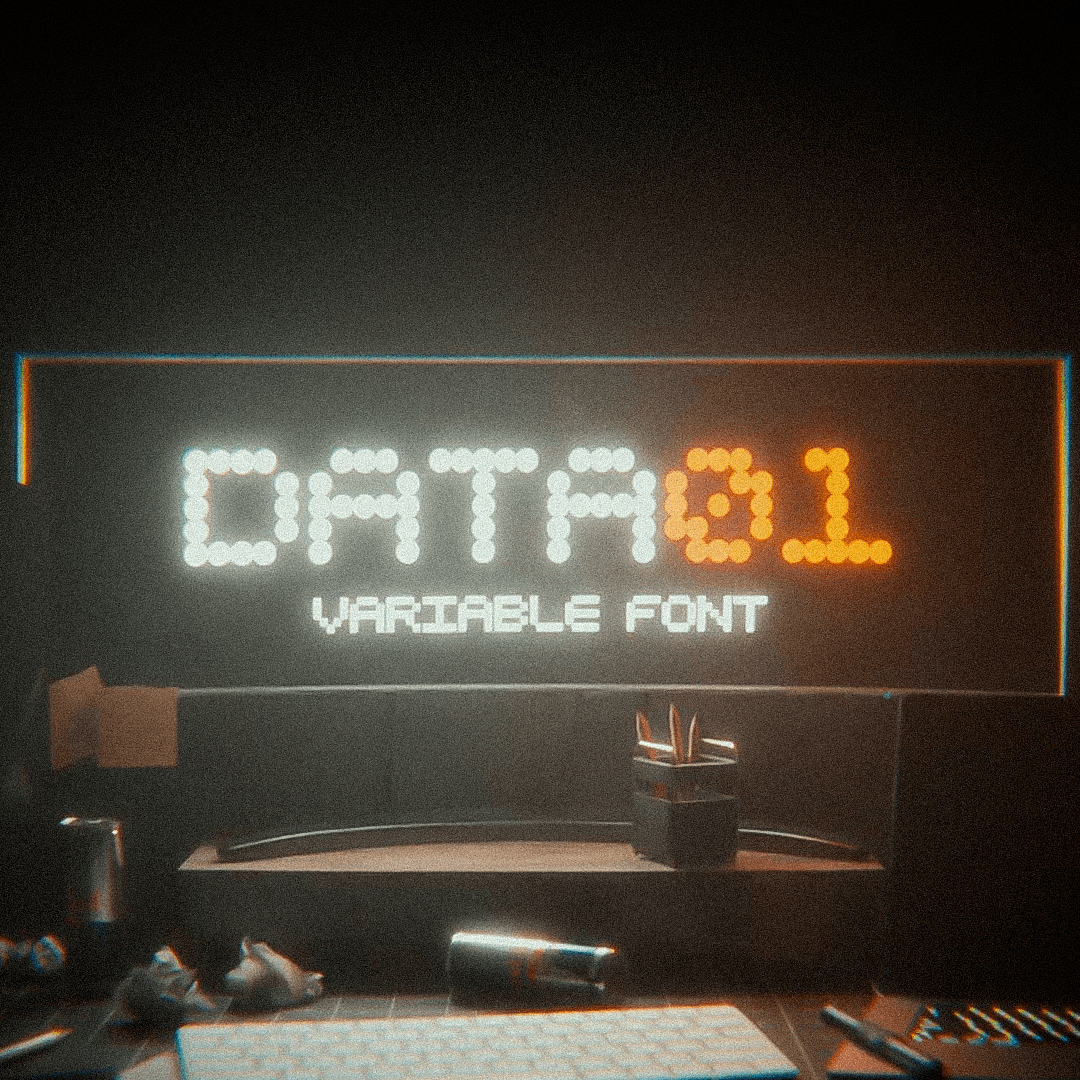
DATA01 is a variable font inspired by dotted displays you see on crosswalks, traffic signs, or train stations. I wanted to take those rough, functional grids and give them a second life—more flexible, more expressive, and deeply digital.

CONCEPT
CONCEPT
The core idea of DATA01 came from dotted fonts—those found on LED signage in public spaces, where each character is built from a grid of circular lights. They’re simple, strict, and incredibly effective.
I was drawn to their raw clarity, but wanted to twist that logic into something more personal. DATA01 keeps that structure, but softens it—adding rhythm, emotion, and adaptability.
It’s also a reflection on how we interact with digital tools today: combining outdated systems with new intentions. A typeface that feels both familiar and strange, like a message from a screen that’s trying to say more than it usually does.
CONCEPT
The core idea of DATA01 came from dotted fonts—those found on LED signage in public spaces, where each character is built from a grid of circular lights. They’re simple, strict, and incredibly effective.
I was drawn to their raw clarity, but wanted to twist that logic into something more personal. DATA01 keeps that structure, but softens it—adding rhythm, emotion, and adaptability.
It’s also a reflection on how we interact with digital tools today: combining outdated systems with new intentions. A typeface that feels both familiar and strange, like a message from a screen that’s trying to say more than it usually does.
RESEARCH
RESEARCH
It started with scattered notes—words like screens, burnout, signal, order. I imagined the font as a tool emerging from visual noise, like those LED displays in train stations cutting through crowds and motion. I looked at how functional typefaces work in constrained grids, how pixel fonts handle legibility, and what makes a character instantly recognizable. I also pulled from sci-fi films, early web aesthetics, and analog tech—anywhere I could find personality hidden inside a system.
The challenge was to keep things simple without losing soul.
RESEARCH
It started with scattered notes—words like screens, burnout, signal, order. I imagined the font as a tool emerging from visual noise, like those LED displays in train stations cutting through crowds and motion. I looked at how functional typefaces work in constrained grids, how pixel fonts handle legibility, and what makes a character instantly recognizable. I also pulled from sci-fi films, early web aesthetics, and analog tech—anywhere I could find personality hidden inside a system.
The challenge was to keep things simple without losing soul.
DESIGN
DESIGN
Each letter was built on a 5x5 grid using circular forms, keeping just enough structure to remain readable. The font exists in three versions—Dot, Pixel, and Contour—all sharing the same core but offering different levels of visual intensity.
It supports ligatures, accents, and full variability between weights. Visually, it’s flexible: clean and digital, but with just enough imperfection to make it human. The 3D teaser was where I gave it narrative weight: a messy desk, glitchy lights, and a feeling of creative overload. The font becomes the only clear voice in a noisy space.
DESIGN
Each letter was built on a 5x5 grid using circular forms, keeping just enough structure to remain readable. The font exists in three versions—Dot, Pixel, and Contour—all sharing the same core but offering different levels of visual intensity.
It supports ligatures, accents, and full variability between weights. Visually, it’s flexible: clean and digital, but with just enough imperfection to make it human. The 3D teaser was where I gave it narrative weight: a messy desk, glitchy lights, and a feeling of creative overload. The font becomes the only clear voice in a noisy space.

DEVELOPMENT
DEVELOPMENT
I built the font in Glyphs, then animated everything in Blender. The teaser acts like a visual monologue—a tired creative surrounded by clutter, with DATA01 slowly becoming the anchor.
I used a fisheye lens, dusty lighting, and sudden camera moves to exaggerate the sense of unease. There’s no dialogue, just short messages displayed in the font itself: “Screens dictate your life.” “Isn’t it time to break free?”
From mood to motion, everything was designed to reinforce the idea: clarity through design, even in the middle of chaos.
DEVELOPMENT
I built the font in Glyphs, then animated everything in Blender. The teaser acts like a visual monologue—a tired creative surrounded by clutter, with DATA01 slowly becoming the anchor.
I used a fisheye lens, dusty lighting, and sudden camera moves to exaggerate the sense of unease. There’s no dialogue, just short messages displayed in the font itself: “Screens dictate your life.” “Isn’t it time to break free?”
From mood to motion, everything was designed to reinforce the idea: clarity through design, even in the middle of chaos.

